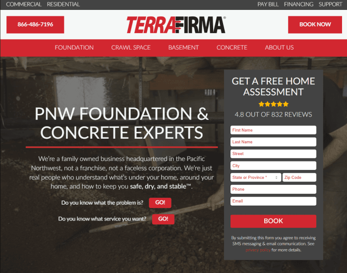
While working for TerraFirma in 2025 I built them a new website (see big image below). I left before we could make it live and they haven’t implemented it yet. It was an improved design:
- Simpler Design – No mega-menus, no clutter. Users can make a decision fast and get closer to what the company wants: contact.
- Better Calls to Action – Before, they had buttons that would take you to secondary pages to fill out or pre-qualify.
- The form allows a user to contact immediately.
- The book-now button was going to create a popup that connects to a scheduling system so the user could schedule an appointment right away.
- The GO! buttons were for people on the fence.
- The phone number would rotate out to track which user was calling.
- Speed – You can’t see from the design, but it was built in native WordPress, meaning there’s no extra stuff to slow things down. The site would load lickety split and that’s without any speed enhancers like caching or UCSS.
- Responsive Design – Yup, the only way to go. It was actually responsive (mobile view right)
I was disappointed. They paid for it, why not use it?